Foundations before components
Typography, spacing, icon rules, and color tokens define the language before anyone draws a button.
Mobile and systems
One design language, adapted per platform without losing identity.
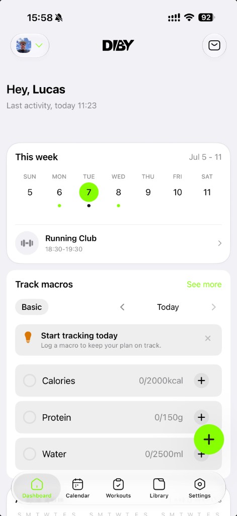
What this page covers
Not a component inventory. These are the decisions I make so mobile products stay native-feeling, coherent, and fast to extend when platforms, breakpoints, and teams change.
Typography, spacing, icon rules, and color tokens define the language before anyone draws a button.
iOS, Android, and web share intent and hierarchy — not pixel-perfect clones of the same control.
Date pickers, keyboards, sheets, and permissions use platform behavior inside a branded frame.
01 · Foundations · Tokens first
Before components, I define the smallest shared layer: type scale, spacing rhythm, icon sizing, radius, elevation, and semantic color. That is what keeps a coach dashboard, athlete app, and marketing web page feeling like the same product — even when the layout changes.
Display, title, body, label, and numeric styles — with line height and weight tuned for thumb reach, dashboards, and dense data tables.
A small set of spacing steps (4/8/12/16/24/32…) so cards, lists, and forms breathe consistently across mobile and web breakpoints.
One icon language: grid size, stroke weight, corner radius, and when to use filled vs. outline — so navigation and actions read instantly at small sizes.
Brand, surface, text, border, success, warning, and accent mapped to roles — not hard-coded hex on every screen.
Cross-platform language
The mistake is forcing one platform to look like another. The goal is shared hierarchy, naming, and behavior — with platform-appropriate navigation, motion, and control chrome.
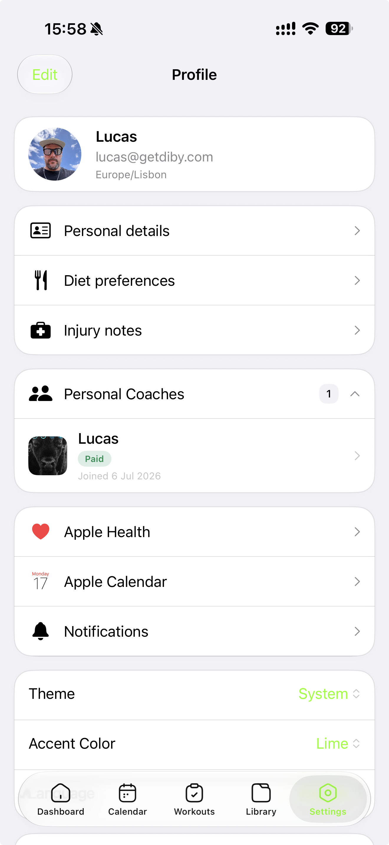
Tab bars, swipe-back, bottom sheets, and SF-weight typography where native patterns reduce learning cost.
Top app bars, FAB placement, ripples, and back behavior that respect Material without copying iOS gestures.
Breakpoint rules, hover states, keyboard focus, and layouts that scale from phone to coach dashboards without a separate product.
Adaptation rules
Shared: information hierarchy, task order, token values, component names, empty states, and error copy. Flexible: navigation shell, transition style, hit targets, and when to use platform chrome vs. custom UI.
Every surface solves the same user task — even when the UI chrome differs.
Same semantic values; platform-specific application where native patterns earn trust.
Tab bars, app bars, and back behavior per OS — not one navigation model everywhere.
Validate on real hardware, not only Figma side-by-side or responsive preview.
Components & variations
Components are not single rectangles. I spec each one with states, sizes, and platform variants — plus documentation that tells engineers exactly when to reach for native controls instead of custom builds.
Primary, secondary, ghost, destructive — with loading, disabled, and compact sizes mapped to token spacing and type roles.
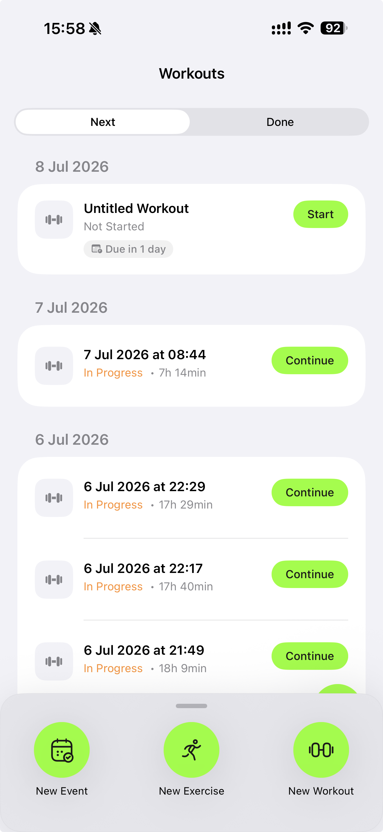
Recurring product patterns: workout rows, macro summaries, plan cards — composed from primitives, not one-off screens.
When a mobile pattern becomes a two-column coach view, or when filters move from sheet to sidebar — defined upfront, not per sprint.
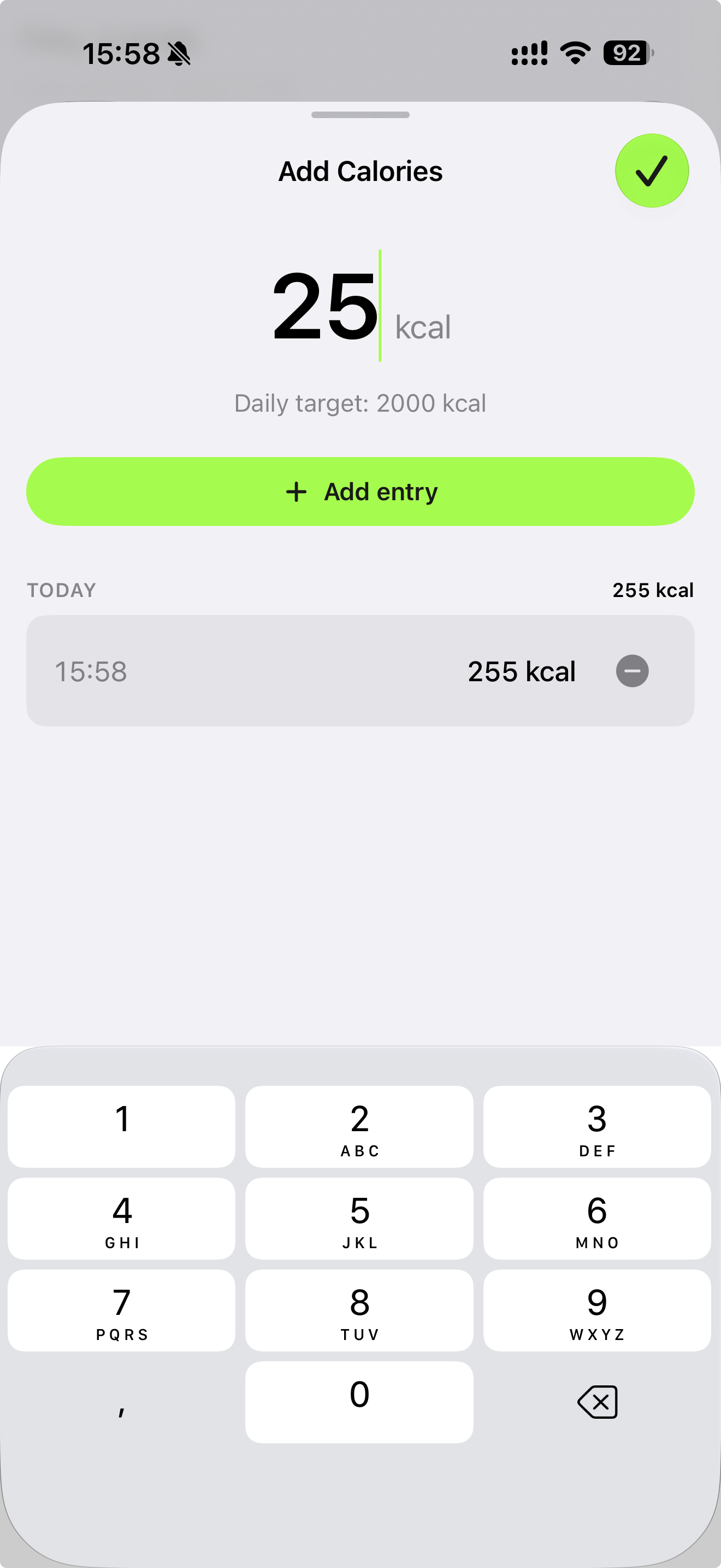
Custom date wheels and numeric pads look polished in mockups — but users trust platform controls for dates, times, and amounts. The design job is to wrap native behavior so it still feels on-brand: labeled fields, tokenized borders, correct keyboard types, and sheet presentation that matches the rest of the app.
Trigger from a styled field; let the OS render the picker. Chrome, Safari, and mobile browsers each differ — document expected chrome and fallback layout.
Decimal vs. integer keyboards, input accessories, and focus management so logging stays fast during a workout.
Use platform share sheets and permission dialogs — customize copy and surrounding context, not the system modal itself.
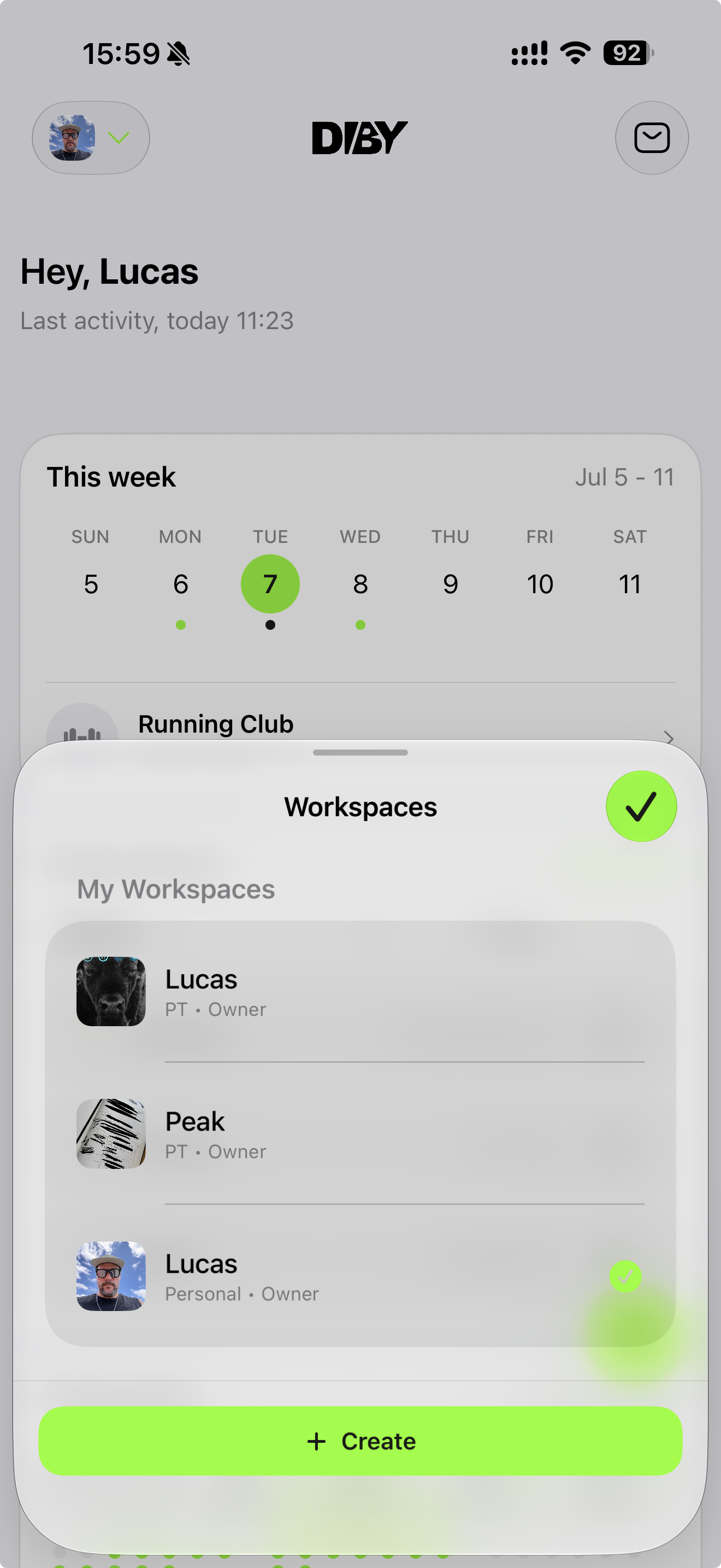
Tokens and components decay when they are not tied to real usage. I keep research, prototyping, and shipping connected so the system reflects what users actually do — not what looked clean in a library six months ago.
Behavior, testing, and product signals before interaction decisions harden.
AI and code prototypes to validate flows, states, and native edge cases faster.
Only patterns that survived testing become tokens, components, and docs.
Product surfaces
These are the flows where mobile products either feel trustworthy or start leaking confidence. Hierarchy, state, pacing, empty moments, and error handling — all built from the same foundations.
Tasks, behavioral signals, and platform limits before patterns harden.
AI-assisted and coded prototypes to pressure-test flows and native edge cases.
Flows, states, hierarchy, and error paths on real iOS, Android, and web.
Tokens, variants, native rules, and adoption notes for design and engineering.
Impact
The payoff is not only a faster-looking platform. When teams adopt and measure shared tokens, components, and patterns, they spend less time rebuilding UI, less time re-testing the same control, and less budget re-solving decisions already made. Without that foundation, every squad ships its own version — and nobody can prove what it cost.
Engineers compose features from documented components instead of re-implementing buttons, sheets, lists, and forms screen by screen. That is direct savings in sprint capacity — not a polish pass at the end.
Shared design tokens and component specs mean fewer one-off decisions in Figma, fewer mismatches in code, and less back-and-forth with AI tools re-generating UI that already exists in the library.
A button, input, or native hybrid is tested at the component-family level — not again on every feature that uses it. Regression surface shrinks; release confidence goes up.
When the base is solid, whole component families and page structures evolve together — new variants, platforms, and breakpoints extend the system instead of forking one-off patches per product.
Onboarding, navigation, paywalls, dashboards, and coach tools compose from proven patterns. Teams ship full flows faster because the hard interaction decisions were solved upstream.
Adoption in design libraries, code, and live product surfaces makes impact visible. I track what is reused, what is still rogue, and where the system is paying back — so the next investment is a decision, not a guess.